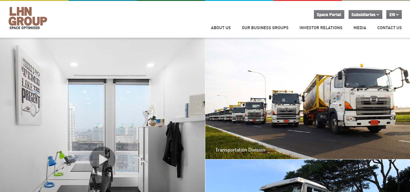
10 YEARS OF WEBSITE DESIGN – WHAT HAS CHANGED?
Without a doubt, website design has experienced tremendous change within the space of ten years. Gone are those days when website designs were limited to texts and hyperlinks with little or no design element on the homepage of most websites. Thank God those days are well behind us. This is how web design has improved chronologically from 2009 till date.
2009
2009 paved the way for better and more responsive websites. website designers, especially Singapore website designers started creating websites that emulated the front pages of magazines and newspapers. Many websites of this time and age were built with one-page layout design and it trended throughout 2009. This type of design allows website designers to put all the website’s information directly in front of the viewer. It was a good strategy, but it didn’t last long. Another important point to note that the price back then is not cheap too! If you are looking for a cheap website designer, good luck to you then!
2010
In 2010, website designers adopted the concept of minimalism for website design. The idea was to create websites that are user-friendly by using simple words and strategically positioned photos. Needless to say that this was a major breakthrough in 2010. Another noteworthy trend in 2010 is the adoption of fixed position navigation. Also, Typography gained its long overdue respect from the world in 2010.
2011
In 2011, full-screen background photos became popular amongst Singapore website designers and other designers across the globe. Also, people started using boards and grids to organize contents on their webpage. What’s more, many website designers adopted the use of diagonal positioning and Parallax scrolling on their website. In that way, viewers could surf the website for hours without getting bored. But that was just the beginning. This year was also the year where more SEO consultancy work gets in built into the website design project.
2012
In 2012, website designers began to prioritize their mobile websites. In spite of the fact that it was a relatively new idea at that time, most website designers executed it aptly. Skeuomorphism – a trend that was literally used by most website designers in 2008 – came back stronger like a prodigal son. This time, it was able to capture users’ attention on the website and kept them engaged. Most of the websites that were created in this year also used the interaction between CSS3 and html5 to boost appeal and functionality.
2013

The commonest trends for this year was “flat design” and Video Backgrounds. Another noteworthy trend that was adopted by most website designers in 2013 was mixed typography (a trend that originated from 2010).
2014
2014 witnessed the implementation of full-width pages which was used to place information at the forefront of webpages. Also, simple web design pages were the order of the day. At this time and age, website owners placed a lot of priority on their website’s comprehensibility. Therefore, many websites started implementing color blocking in their designs. Less is more, as Steve Jobs used to say!
2015
In 2015, Skeuomorphism became popular once more. But this time it was mixed mildly with flat website design and custom typography to improve interaction on the website. 2015 also witnessed a more adaptive use of website icons and inbound links.
2016
Many people turned to background videos in 2016. Typography and moving graphics were the norms on most homepages. This is the start of more fanciful web design elements such as Videos and Animations.
2017
Parallax scrolling effect, virtual reality, and custom typography were the most notable trends of 2017.
2018
Website designers started using colors to make their website beautiful. Also, animation, data storytelling and illustration became popular among website designers.
WHAT IS BEING USED NOW?

Now that over 70% of the world’s internet users are smartphone owners, most website designers are building their website with these 3 trends at the back of their minds: Mobile-first, Personalized illustration, and dynamic audiovisual background.
All things considered, trends that would survive this year and subsequent years would probably include mobile-first, simplicity and personalized illustration focused websites.
More Info : https://sgwebdesigner.org/singapore-web-designer-ten-years-changes/


Comments
Post a Comment